

Design Breakdown: The Engineering Behind RVX's Retro-Futuristic Look
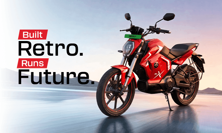
Most design breakdowns talk about how a vehicle looks. This one is about why it looks that way, the actual engineering and design decisions behind the Revolt RVX's distinctive retro-futuristic aesthetic, and how form and function intersect rather than compete on this particular bike, examined with the same level of detail usually reserved for performance specifications rather than styling.
Retro-Futuristic Isn't a Contradiction, It's a Design Philosophy
The term gets used loosely, but on the RVX it describes something specific: silhouettes and proportions that echo classic motorcycle design, a muscular tank area, a confident stance, combined with distinctly modern surfacing, lighting, and details that make clear this is unmistakably a 2026 electric motorcycle, not a nostalgia piece. Getting that balance right is harder than it sounds; lean too far retro and a vehicle looks dated on arrival, lean too far futuristic and it loses the emotional warmth that makes retro styling appealing in the first place.
The Front End: Where Retro and Modern Meet Most Directly
The RVX's front fascia is where this balance is most visible. The headlight assembly carries a shape and presence reminiscent of classic motorcycle design cues, while the actual lighting technology, full LED, is entirely modern, both in efficiency and in the sharp, deliberate light signature it produces after dark. This is a common pattern throughout the bike's design: classic shape, modern execution, repeated consistently enough that it reads as a deliberate philosophy rather than a one-off styling choice.
Why the Stance Matters as Much as Any Single Detail
Beyond individual styling elements, the RVX's overall stance, how it sits, how its proportions read from a distance, does more work in creating its sporty, confident presence than any single design detail could alone. This is deliberate: the upside-down front forks aren't just a performance component, they visually reinforce the bike's aggressive, premium positioning, since USD forks are a hallmark typically associated with serious performance motorcycles rather than standard commuter bikes. A rider who knows nothing about suspension engineering will still register that visual cue as "this bike means business" at a glance.
Material and Panel Choices
Design isn't only about shape, surface treatment and panel design communicate a lot about a vehicle's positioning too. The RVX's panel lines are sharp and deliberate rather than soft and utilitarian, a choice that reinforces the "sports" positioning Revolt has built the bike around rather than presenting it as a purely practical commuter option. Every crease and surface transition on the bike is placed with visual intent, contributing to a silhouette that reads as dynamic even while the bike is standing still.
Colour as a Design Tool, Not Just a Choice
The RVX's factory colour options, Pearl Black, Electric Blue, and Eclipse Red, aren't arbitrary. Each is chosen specifically to interact with the bike's surfacing and panel lines differently: darker tones emphasize the sculpted body lines through shadow and highlight, while brighter tones like Eclipse Red push the bike's presence and visibility, particularly relevant for a design built around being noticed in city traffic. Choosing a colour, in this sense, is less about personal preference alone and more about which version of the bike's design language you want to emphasize.
Function Driving Form: The Practical Side of Design
Not every design decision on the RVX is purely aesthetic. The bike's overall proportions and ergonomic layout are also shaped by practical requirements, accommodating the 3.24 kWh battery pack within the frame without disrupting the bike's visual balance, positioning the display and controls for genuine everyday usability rather than just showroom appeal. Good design, done properly, rarely separates form from function this cleanly, the best design decisions usually serve both simultaneously, and the RVX's design team clearly worked within that constraint rather than treating styling as an afterthought layered on top of the engineering.
Designing for a Generation That Notices Details
There's a reason retro-futuristic design has found particular resonance with younger electric bike buyers specifically: it offers a sense of character and story that purely futuristic, minimalist EV design sometimes lacks, while still feeling unmistakably modern rather than dated. It's design that photographs well, that invites a second look parked outside a cafe, and that doesn't apologize for wanting to be noticed, which aligns closely with how younger riders think about vehicle ownership as a form of genuine self-expression, not just transportation. This is also a demographic that engages closely with design details through social media, where a distinctive silhouette or lighting signature can stand out in a single photo far more effectively than a spec sheet ever could.
Design Details You Might Miss on a First Glance
Some of the RVX's most considered design decisions aren't immediately obvious from a passing look. The way the tail section tapers relative to the tank's visual weight is calibrated specifically to keep the bike's proportions feeling balanced from every angle, not just the three-quarter view most commonly used in marketing photography. Panel gaps and seam lines are positioned deliberately rather than wherever manufacturing happened to make convenient, contributing to a finished look that reads as considered rather than assembled. These are the kinds of details that reward a longer look, and that riders who spend real time with the bike tend to notice and appreciate more the longer they own it.
How the Design Team Approached Balancing Two Audiences
One of the harder challenges in designing the RVX was appealing simultaneously to riders who appreciate genuine retro motorcycle heritage and to younger buyers who have no particular nostalgia for that era but respond to the aesthetic on its own visual terms. The retro-futuristic approach resolves this by not leaning on nostalgia as its primary appeal, instead using classic proportions as a design foundation while letting modern execution, lighting, surfacing, and technology carry the actual "new" feeling. It's a design approach that doesn't require the viewer to know or care about motorcycle history to appreciate, which broadens its appeal considerably.
Design That Ages Well
A final consideration worth raising: good retro-futuristic design tends to age more gracefully than purely trend-driven styling, since it isn't tied to a specific, fleeting design moment the way some purely futuristic EV aesthetics can be. Classic proportions have already proven their visual staying power over decades, which gives a design built on that foundation a reasonable case for still looking considered and intentional years down the line, rather than dated the way some purely of-the-moment styling can.
Why Design Deserves the Same Attention as Specs
It's easy for design to get treated as a secondary consideration behind performance figures and range numbers, but for a great many buyers, design is genuinely the first filter applied before any spec sheet is even opened. A bike that doesn't visually resonate rarely gets a second look regardless of its underlying engineering, which is exactly why the design decisions covered here deserve to be understood with the same seriousness as any torque figure or range claim.
Want to see the design details in person? Book a test ride and take a closer look for yourself.